Barcelona Pavilion “Places Where One Cannot Go” ──With Reference to Matisse Paintings
HENRI MATISSE, Nasturtiums with ‘Dance’ II, 1912
The topic of today’s talk is about the Barcelona Pavilion by Mies van der Rohe[*1]. But before that, let me talk about Atelier Nishikata simply. We always pay attention to something strange whenever we experience or design architecture, see paintings, and watch films. Sometimes they are very trivial, but the beginning of design thinking. Such awareness is important for us.
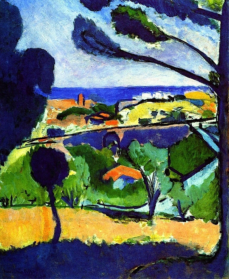
We’ll show some paintings to tell you what that means, which are by Henri Matisse, a French painter. First is View of Collioure and the Sea. What do you think of this? The title tells it is a picture of the sea. So, where is the sea?
 1 Henri Matisse, "View of Collioure and the Sea," 1911
The blue part in the distant view looks like the sea and there is the shadow of trees in the foreground. So I think what most of us first thought was like that this was the view of the sea from a hill. Maybe what is in the middle distance would be a bank or something.
Let’s take a closer look at the painting again. Don't you think the shadow in the foreground is unnaturally blue if it was a shadow of trees? Why is it so blue in the middle distance if it is a bank? Those blue colors are similar to the blue of the sea, aren't they? So, if you think of all three blue parts as the sea, it can be said this painting depicted a very zigzag peninsula. When you notice the blue connection, completely different geography has emerged.
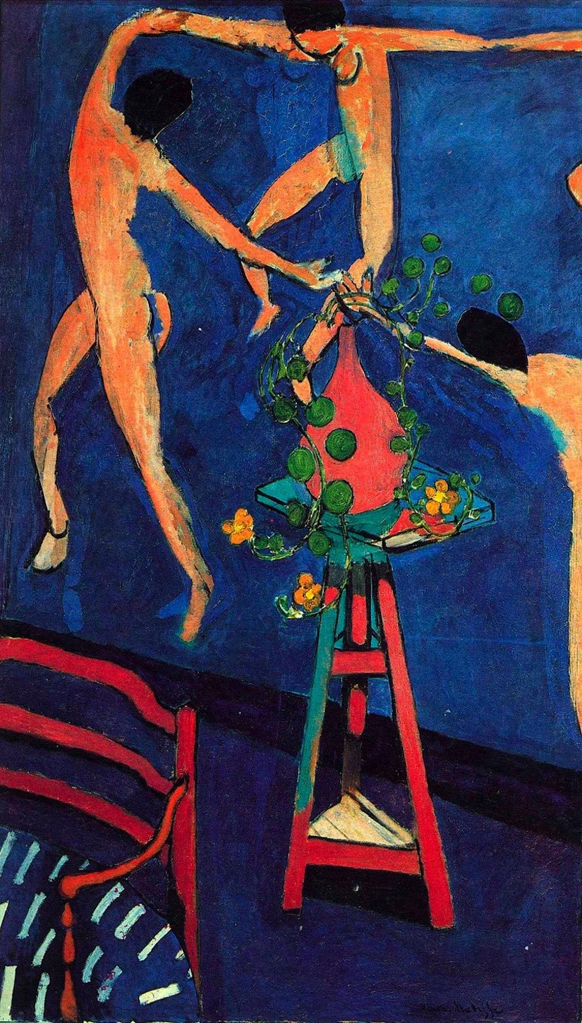
In this way, in Matisse’s work, when you notice something specific, the pictorial space of it changes drastically. In this painting, the awareness of why the shadow in the foreground is so blue can be a trigger. Then, what is depicted next picture? Does it depict three nude women hand in hand dancing in a dark blue room?
 2 Henri Matisse, "Nasturtiums with "Dance" II," 1912
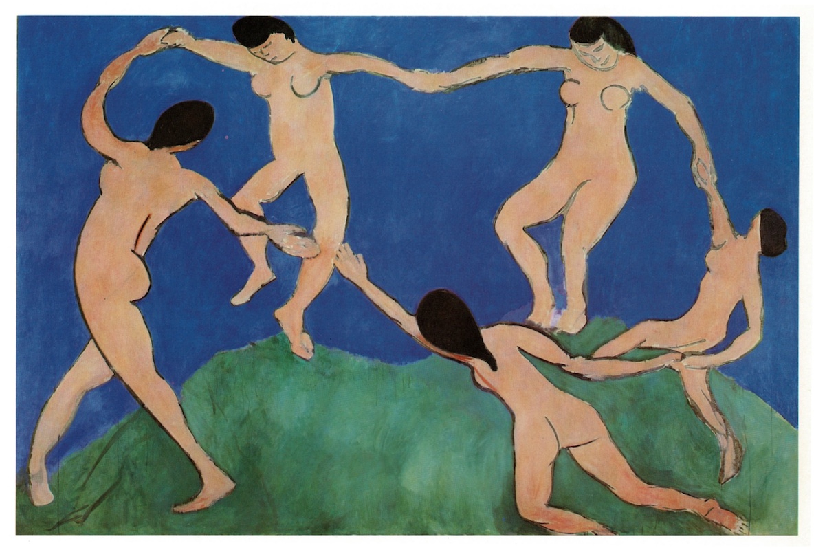 3 Henri Matisse, "Dance I," 1909
The fact is that it depicts Matisse’s atelier. The nude women in the back look exactly like those in his other painting, called Dance, painted in 1909. In other words, what is this painting is “picture in picture.” The title is Nasturtiums with ‘Dance’ ll painted in 1912. Then, the thick black line running diagonally in the middle of the picture plane is not a baseboard of the atelier, but part of the picture frame of Dance. In the atelier, there is an armchair and a stool, on which a red vase with nasturtiums. Therefore, what he depicted actually was the two-dimensional picture, and a three-dimensional space, which was his atelier.
But Matisse’s paintings are not straightforward. Although it can be said that the tripod stool belongs to the three-dimensional space of the atelier, what about the red vase[*2]? The three women may seem to be dancing around the red vase. Which does this vase belong to, the Dance, or the three-dimensional space in the foreground? In the painting, two and three-dimensional space are intricately changing. Let’s move on to the Barcelona Pavilion, having this in your mind.
Three “Places Where One Cannot Go,” Large Pool, Small Pool, and Light-Box, in the Barcelona Pavilion
I think you’ve been thinking a lot about places you can’t go. Atelier Nishikata always has had a great interest in this question. It started with the Barcelona Pavilion. The Pavilion was built in 1929. It was the time when Mies had still worked in Germany.
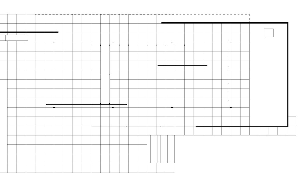
This is the floor plan of the Pavilion. There are three “places one can’t go,” which are a large pool, a small pool, and a light-box.
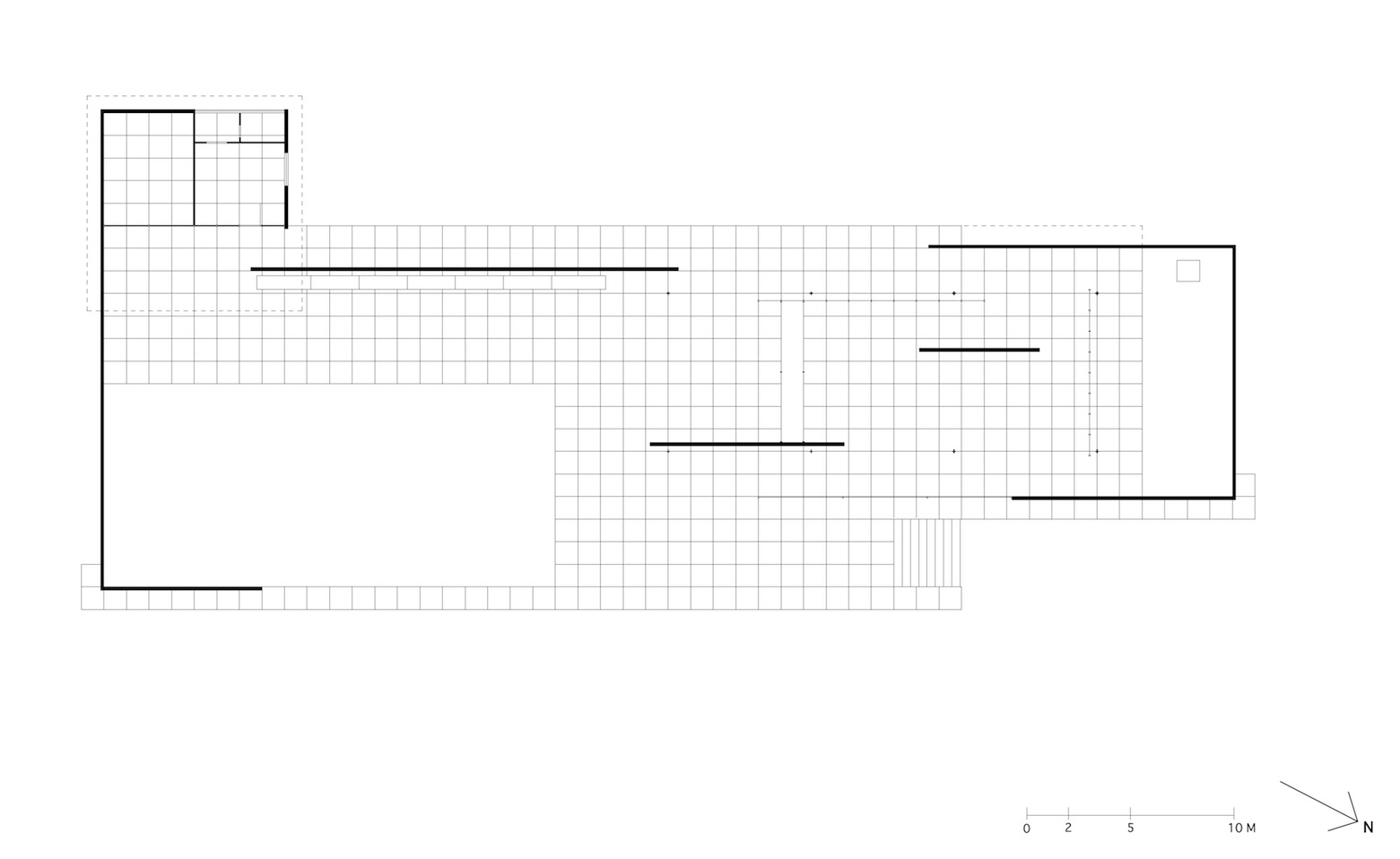 4 Barcelona Pavilion: floor plan
Delineator: RN
The gist of our study is that these three elements are the major spatial structure of the Pavilion. “Structure” in this context is different from structural engineering. It is a figurative way of saying, like a structure of a sentence or cultural structure. It is an essential factor involved in spatial experiences.
It is seemingly a simple thing to think of a place as “places you can go” or “places cannot go.” So much so that I believe there are few architects to design architecture focusing on that point. And also, no one but us will interpret the Pavilion with this viewpoint. The reason is simple. The history of architecture has developed by opening up the possibilities of places that can go. Thinking of places to go is a positive way of thinking. It’s a very progressive and conscious effort. On the other hand, to think of places can’t go seems minor, not a big deal. It might even have a negative image.
For example, people always try to build the highest tower anywhere in the world. In the Middle Ages, people in San Gimignano, Italy, made a lot of towers to show their power. The development of a space elevator is getting closer to reality. A transparent glass floor sticking out to the air is a skywalk in the Canadian Rockies. The desire to go opens up these possibilities.
The desire to turn “places one can’t go” into “places one can go” made it possible even to come close to the mouth of the Merlion, from which water comes out. You may know this. It is the exhibition by an artist Tatzu Nishi at Singapore biennale 2011. He has been creating his work like this in various venues around the world. The Merlion doesn’t look like the real Merlion in the Park, but it’s true. During the biennale, it was temporarily a hotel.
From these, it would be natural to think that one of the motives of architecture is to change inaccessible places to places people can go.
ON THE PODIUM
This is a diagram of the three “places where one cannot go.” It shows that the degree of inaccessibility is increasing from the large pool to the light-box.
 5 Diagram of the three places
There is no roof around the large pool. In contrast, around the small one, the roof extends to the edge of the pool. And the light-box is entirely blocked by the glass screens. It looks like a space as if the light is enclosed.
Regarding the large pool, it occupies much of the roofless space. On the bottom of the large pool, there are pebbles, natural materials. Kids may step into the pool with no hesitation, especially on hot days. It is such a friendly place compared to the others. But mostly, adults wouldn't walk in. It means that this pool is the place you can enter if you want, but in a social context or institutional reason, it is a "place you cannot go."
The small pool, next, is surrounded by a U-shape wall. The edge of the roof and the one of the floor are matched. It looks shallow, but the original drawing shows that it used to be deeper. Take a look at the drawing. The depth was 60 centimeters. The bottom was covered with dark-colored glass panels, so it would've been hard to see the bottom. And in contrast to natural pebbles in the large pool, those glass panels are industrial products, so it looks very artificial. Because of such a look, it is not easy to walk into it. That means the bar of inapproachable got higher.
Architecture historian Kenneth Frampton describes these pools. He says, about the large pool, the surface of water ripples by the wind because it is in open space, and about the small pool, the surface doesn’t move as if it is out of touch with nature[*3]. The two spaces are contrasting.
Then, in between the two pools is the light-box. A picture on the left is what you see the box from the large pool area. The right is what you see from the inside. The views are almost the same. That means the light-box belongs to both sides, but from either side, it is completely blocked, and there is no clue to go.
Concerning materials, around the large pool, the material of the walls, the floor, and the long bench is all the same, Roman travertine. Compared to that, you can see a variety of materials and elements around the small pool area. We see apparent differences between the large pool’s openness and the small pool’s artificial existence, and between the monotonous world of the area of the large pool, and the luxury and colorful world of the area of the small pool. So one role of the light-box is like a hinge to connect these two areas. Without it, the two areas will be too far apart and unbalanced in terms of spatial quality.
With this, we can see the relationship between the three places where we cannot go. That is, the light-box at the center is connected to the extremely contrasting atmospheres on both sides' pool areas.
But that is not a full explanation of the light-box. Let's take a look at the short sides of the light-box as well, there is the Tinos green marble wall at the front, so it can't be seen. The other short side is like this. A black glass panel is glazed. Only this side gives you a clue of the depth. Nonetheless, it is still unknown, in particular about the light. It remains completely closed. As long as you are on the podium, you can’t get it clear what the light-box is like. That is one of our physical limitations.
This light-box is exactly what I expressed like something strange or undigested. This was the very beginning of our pursuit of Mies.
DOWN FROM THE PODIUM
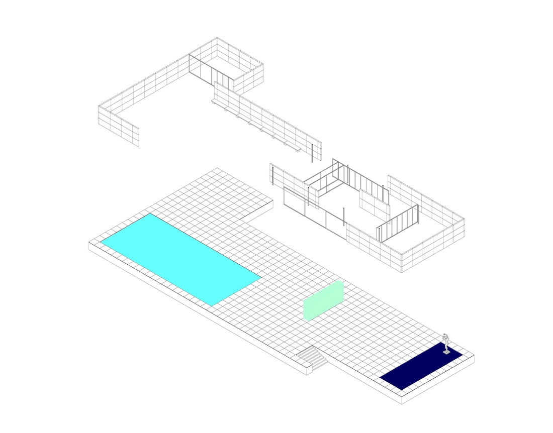
What I’ve been talking about was what was happening on the podium. Podium is also one of the vocabularies that repeatedly appeared in Mies’ architecture. He first realized a podium in this project. The new National Gallery is the result of a continual attempt. And more, grid also first appeared here for the first time in a sense. So, it can be said that almost every important vocabularies came up in the Pavilion project. Then, let’s check the relationship between the podium and the elements on it with isometric drawings.
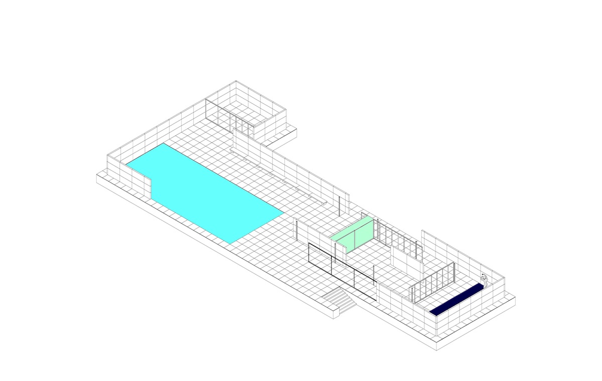
It has roofs. You can see a square hole in the main roof, now that tells you how the light comes down.
 6 Barcelona Pavilion: isometric
Delineator: HO
Taking the roofs away, every element on the podium shows up. Be aware of the grid here. It is part of the podium and also floor material. One thing we should re-realize is that both areas of the small and large pool are on the same grid pattern, sharing the same floor material. On top of that, in the small pool area, the various elements, such as the onyx marble and cruciform pillars stand. The remarkable thing is that the grid pattern rules not all elements on the podium.
 7 Barcelona Pavilion: isometric
Delineator: HO
For instance, this onyx wall and this green marble wall are not right on the grid line. And also, both edges of them don’t end at the grid line.
The edges of this glass screen stop at the grid line, but the screen itself is not on the grid line. The same happens with the other elements. They don’t follow the grid layout at all.
 8 Barcelona Pavilion: part of floor plan
Delineator: RN
What that shows is that they are something like temporal existence, like chess pieces on the chessboard, in comparison with the presence of the podium. They are secondary elements here, so to speak, although they are fascinating and gorgeous. Therefore, we can say that a group of those elements and the grid belong to two different classes.
Picking such elements away, the podium and the three inaccessible places remain. Among them, the two pools are concrete existence because they have the bottom and can be measured. And they belong to each spatial area on either side on the podium. However, only the light of the light-box is invisible and doesn’t seem to belong to each pool area. It is just an abstract being.
 9 Barcelona Pavilion: isometric
Delineator: HO
Now, what left on the podium is the grid and the light in the light-box. This drawing is an utterly abstract expression because light doesn’t have a form. It’s a different spatial world from that on the podium.
 10 Barcelona Pavilion: isometric
Delineator: HO
A more emphasized concept is like this. Here, let's look back at the painting of Matisse to get the meaning of it.
 11 Barcelona Pavilion: isometric
Delineator: HO
The Red Vase in the Nasturtiums with ‘Dance’ ll and the Light-Box in the Barcelona Pavilion
 12 Henri Matisse, "Nasturtiums with "Dance" II," 1912
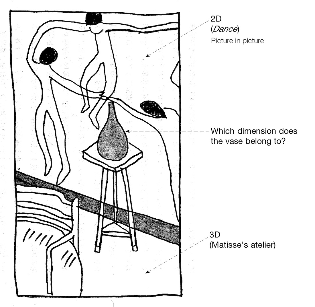 13 diagram of "Nasturtiums"
Delineator: HO
First, we thought that Matisse attempted to depict two different space dimensions on a picture plane, which is two-dimensional. What the two spaces meant is the space of the painting Dance and the space of his atelier. However, we get confused when we noticed the existence of the red vase. It’s because the original Dance doesn’t have it. Even so, the red vase is being there as if it was included in the Dance. That means we could say the vase doesn’t belong to the 3D area, nor the 2D in the upper from the black baseboard.
The complex spatial structure of the painting Nasturtiums with ‘Dance’ ll is very attractive and interesting. How can we put something like this into 3D space in real? It can be said that the Barcelona Pavilion is a rare example in which the light-box landed this dynamic space structure in the real world.
One is a two-dimensional painting and the other three-dimensional architecture, but the functions of the red vase and the light-box are very similar. They jump over the dimensions they belong to and connect them to different dimensions. As a result, an observer experiences a space like no other.
It is assumed that Mies was trying to bring about a different spatial experience from the real visible 3D world. In short, by setting “places one can’t go,” he attempted to REACH the spatial experience in another dimension. I don’t know if another dimension means the fourth dimension, but I believe the light-box is the thing that connects two conflicting space worlds like the red vase in Matisse’s painting. Mies has been giving us great spatial experience by setting inaccessible spaces. That is what should be called universal space.
In the beginning, I said the idea of “places one can’t go” has a negative image. I don’t know why, but humans of intelligence often build walls literally to block people from come-and-go. Berlin used to have such walls. As is well known, people in West Germany set the area around the Mies' New National Gallery as a cultural district so that they could show off to people in East Germany. What Mies did was different from such walls. I think it is also essential to think about the difference.
(Additional note is coming soon!)

